Enemy Squid Design and Animation

This week has been dedicated to final design of- and the beginning of animating the new enemy my team created for our game.

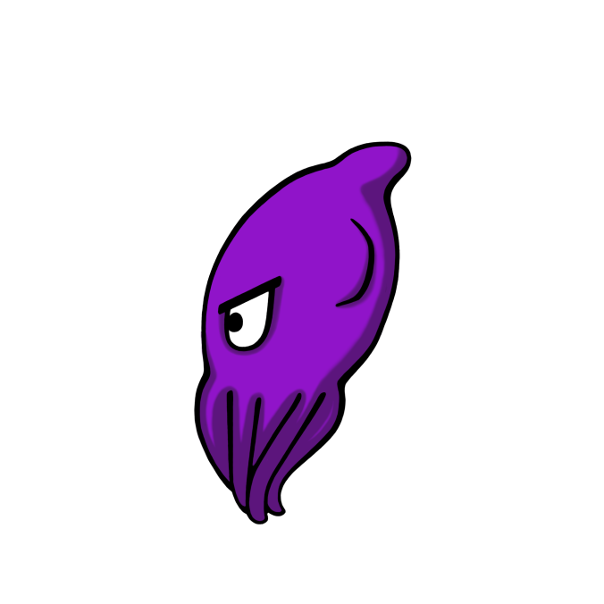
This new enemy is a squid that we feel complement the other enemies (piranhas, swordfish and blowfish) in the aquarium rather well, as this enemy has its own projectile based attack. It will, when in range of Stephen (the player character), let out a cloud of ink to blur the vision of Stephen (the player) and thus make it more difficult to see or move when swimming in the “inked” area. The squid also has its own movement pattern, where it is meant to mirror the movement of an actual squid. This pattern is a zig-zag pattern where the squid is launching forward/upward and then coming downward/backward in a slower manner. The zig-zag movement will be greatly helped by the swim animation when it is finalized and in place.

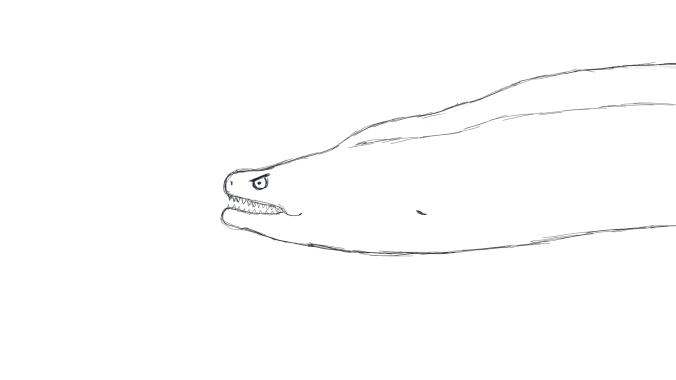
When it came to the visual design, the biggest struggle for me (design wise) I would say was the fact that I had to try to mold the look of a squid into the cartoony style of our game. It took me a couple of tries, but I kept the original sketch and worked with that.

20170222_121256

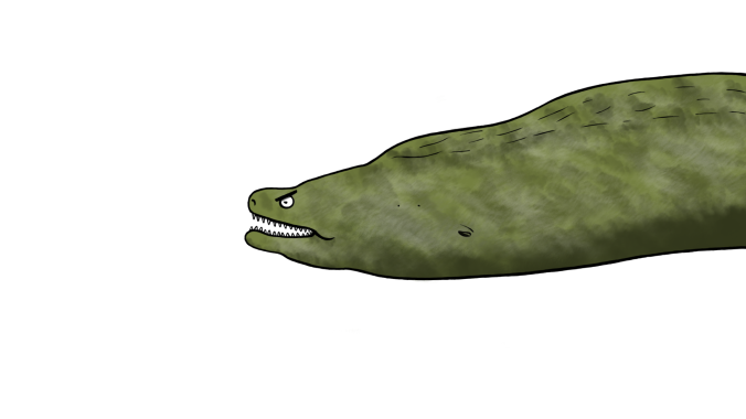
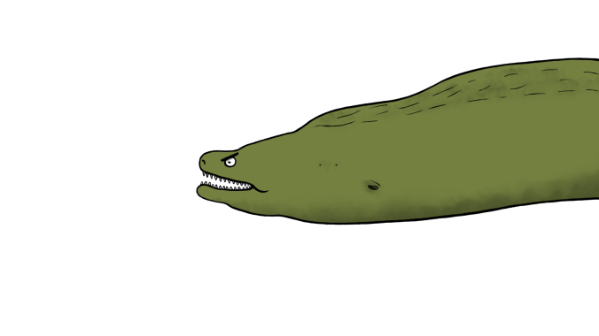
To make the placeholder, I went through the same process I have developed throughout the last couple of weeks. First, I clean up the sketch and make the line art. After that I add local colors and lastly some simple shadows. Because this is a simple placeholder for our game, I did not bother with fancy lighting of the character. The colors were decided in our Style guide which I’m also working on currently. Purple felt like a good squid color and it suited the color scheme of the rest of our characters. They’re all warm colors to stand in contrast to the background consisting of only cold colors.

squid-enemy_placeholder1

So, this week I made my first animation of the squid and kept it sketchy for the ability to make changes if needed. I did a frame by frame, with a total of 17 frames. This one is the swim animation, but the squid is also supposed to have 3 other animations (if everything goes well).

For the swim animation, I wanted to keep the cartoony feel and go for a bit more squash and stretch (which is the visual sense of something being crunched/squashed together and then stretched out). This principle of animation is quite difficult to master, but over all I’m happy with the result.

squid-animation-swim1

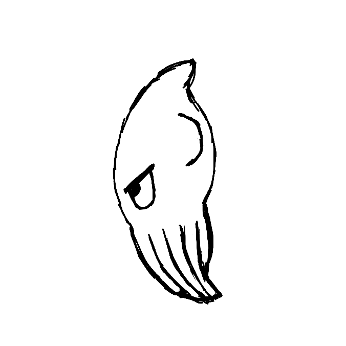
I decided on the end keyframes, where the movement would “peak” both ways, and drew those poses. Stretching out the tentacles and the body for the launching forward look and then squashing the body and tentacles to make it look like the squid is gathering momentum. In the other frames, I made drawings of the tentacles in positions that makes a transition between the end frames and thus complete the animation. To create a loop, I simply copied frames and placed them in the correct order to make the cycle.

Next up will be cleaning up the animation, coloring it and adding shadow. Then I will have a complete work process to apply to the coming animations.


The Moray Eel boss

This past week me and my team have been discussing the possible implementation of a boss in our game (SelFish). As of yet, it’s not final that we will have this boss in our finished product. However, we felt that it is important to include a designed concept with the core mechanics needed before the feature freeze coming up next week. So therefore, I’ve mainly been focusing on this boss this sprint.

The team decided on a moray eel as the boss enemy, partly because of the movement pattern it allows for. We want it to stay still on one side of the screen and attack from that same side, never revealing more than its head and a portion of its body. It also made sense to make the boss a moray in regards to the aesthetics of the aquarium, being a more reef inspired kind of environment. Furthermore, implementing our own boss character will make this game stand out from the others with the same concept. As a side effect bonus, the moray will be easier to animate than the originally intended boss of an octopus.

It was clear that everyone in our team knew the importance of the design aspect, that we would discuss the behavior and attacks of this enemy boss before going into the pure aesthetics. We also wanted to have it make sense in the story that this moray eel is attacking the player (Stephen). One idea that came to mind was that Stephen, in self-defense, is attacking the moray eels’ children (implemented as their own enemies of the main character) and thus making the mama/papa eel really angry.

When it came to visually designing this boss, I had a lot of freedom. After scrapping a few sketches that didn’t live up to expectations of visual appeal, I ended up with a sketch that I liked and felt was an accurate representation of the character.

boss-moray-eel-sketch

In my previous blog post I mentioned line art as a weak point of mine, but have since then developed a technique that works for me when cleaning up the outlines of my artwork. I start with making a thicker line on a separate layer (in Photoshop) over the sketch and proceed with using the eraser to shave off the thickness and make the lines have the right weight to them. I then go back and forth with the brush (filling in the line where needed) and the eraser until I achieve the look I want. Using this technique is a quick method for decent looking line art.

After line art was done, I moved on to local colors. I chose a khaki green, darker hue that I felt represented the antagonist role of this character well. This color also stands out from the background but does not visually conflict with the player character Stephen (who is yellow).

boss-morayeel-v1-1-2

Because I wanted some visual interest and not just a flat color, I added some textures in the shape of different values and hues. And although that made it look appealing, I wondered if this look could possible conflict with the rather simplistic look of the rest of our assets/characters in our game. So, I made a simpler version of it as well, for the team to be able to choose from.

bossmoray-v2-1-2

As far as the shadows go, I simply added a form shadow signaling that the light is coming from above. Nothing fancy, no key lights. This is after all just a concept placeholder of a boss that may not end up in our game.

Over all, I’m pretty happy with the result and we now have our boss concept done with both design and aesthetics.


Meet Stephen 1.0

This is Stephen. He is the main character of the game SelFish, which is a game about this little fish who gets picked on by the other fishes in the aquarium where they all reside. Eventually he’s had enough, snaps and tries to kill everyone.

stephen-concept

As one of the graphic designers in the Team Unicorn, I designed and drew Stephen. What I wanted to convey in the design was the feeling of Stephen as the underdog, slowly traversing the boundaries of sanity and loosing his mind to become a full fledged killer.

I already had an idea of what he would look like, considering I had already spent the previous week/sprint on character concepts.

It was a natural choice to go for a small body, and overall small Stephen. He is after all the harassed underdog. Big eyes that will be used for displaying different facial expressions was also a concious choice. And I also gave him an ominous smirk.
Stephen has no dorsal fin, which is further confirming his social position in the aquarium. And as an artist, I found it easier to tie his personal look together whitout the fin. His back is simply too small to put a decent looking fin on.

When it came to production, I divided my work into different categories;
Sketch, line art, local colors and key shadow + key light.

I chose one of my concept sketches and cleaned it up a bit, then started to work on the line art. This step is most time consuming and tedious task… until you find yourself having fun with it! Getting the hang of line weight and how to produce relatively straight lines is crucial to achieving the look you want for your line art.

The general look we (the dev.team) wanted for our game was a cartoony and humoristic version, pretty close to the original concept. So therefore I decided to make the line art as clean and sharp as possible (generating hours upon hours of work in Photoshop). I used a hard edged brush and varied the size where needed to get the right line weight. I chose to build the lines and then erase away the excess to try and achieve a nice look.

Next up was the local colors. Here I wanted a color that makes Stephen stand out from the background. The player should always be able to spot where they are on the screen, so after talking about color choice with the team I went with yellow. This contrasts well with the blueish underwater background color in our game.
I chose white for the eyes, as this further helps to see where the player character is on the screen.

When it came to the lighting I wanted to make it simple, mirroring the look and feeling of the game. I shaded with a darker yellow color and used a soft edged eraser to blur the edges of the shadow. Same process with the key light (light source from above).

Last but not least, an honorable mention to; Photoshop, which has been working against me troughout the whole process! Freezing up, refusing to cooperate and almost crashing on me. Pro tip when this happens: 1. Patience and 2. Save your project often.