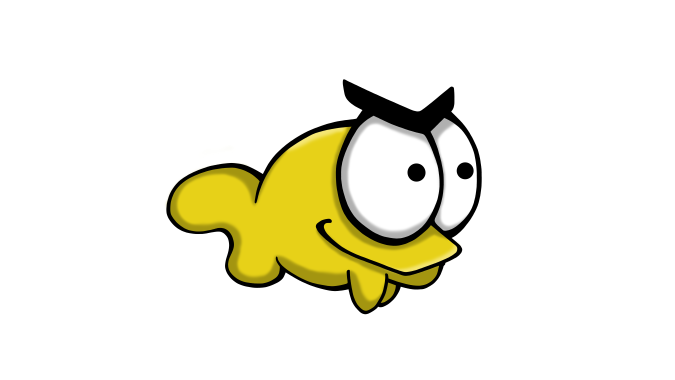
This is Stephen. He is the main character of the game SelFish, which is a game about this little fish who gets picked on by the other fishes in the aquarium where they all reside. Eventually he’s had enough, snaps and tries to kill everyone.

As one of the graphic designers in the Team Unicorn, I designed and drew Stephen. What I wanted to convey in the design was the feeling of Stephen as the underdog, slowly traversing the boundaries of sanity and loosing his mind to become a full fledged killer.
I already had an idea of what he would look like, considering I had already spent the previous week/sprint on character concepts.
It was a natural choice to go for a small body, and overall small Stephen. He is after all the harassed underdog. Big eyes that will be used for displaying different facial expressions was also a concious choice. And I also gave him an ominous smirk.
Stephen has no dorsal fin, which is further confirming his social position in the aquarium. And as an artist, I found it easier to tie his personal look together whitout the fin. His back is simply too small to put a decent looking fin on.
When it came to production, I divided my work into different categories;
Sketch, line art, local colors and key shadow + key light.
I chose one of my concept sketches and cleaned it up a bit, then started to work on the line art. This step is most time consuming and tedious task… until you find yourself having fun with it! Getting the hang of line weight and how to produce relatively straight lines is crucial to achieving the look you want for your line art.
The general look we (the dev.team) wanted for our game was a cartoony and humoristic version, pretty close to the original concept. So therefore I decided to make the line art as clean and sharp as possible (generating hours upon hours of work in Photoshop). I used a hard edged brush and varied the size where needed to get the right line weight. I chose to build the lines and then erase away the excess to try and achieve a nice look.
Next up was the local colors. Here I wanted a color that makes Stephen stand out from the background. The player should always be able to spot where they are on the screen, so after talking about color choice with the team I went with yellow. This contrasts well with the blueish underwater background color in our game.
I chose white for the eyes, as this further helps to see where the player character is on the screen.
When it came to the lighting I wanted to make it simple, mirroring the look and feeling of the game. I shaded with a darker yellow color and used a soft edged eraser to blur the edges of the shadow. Same process with the key light (light source from above).
Last but not least, an honorable mention to; Photoshop, which has been working against me troughout the whole process! Freezing up, refusing to cooperate and almost crashing on me. Pro tip when this happens: 1. Patience and 2. Save your project often.
It is clear what you have been working on and you give a good explanation to the different design choices when it comes to the character. I like that you gave an explanation to who the character is and the reason for why he has an ominous smirk.
What I don’t get is the reasoning behind why you skipped the dorsal fin, I get the reason that it wouldn’t fit, but how does it further confirm his social position? Is it because he looks smaller? Some more explanation would be good for this statement.
I got a clear understanding of your work process and the tools you have used, and even the technique that you used to get the result. Although it would have felt more complete if you posted the original concept since you mentioned it, so you could see the process from concept to sprite.
All in all the post is insightful and paints a clear picture of what has been done and how it was done.
LikeLiked by 1 person