I am going to write about an artifact I made last week. This artifact is a swimming animation I made for the main character Stephen.
I started out with the placeholder, looking at it and I thinking about how the fin should move to make it look like the player character is swimming. I thought the frame by frame method (which is drawing one frame at a time, to make an animation) would be most suitable for the character considering the enemies were animated in the same way and it look very natural and organic. This animation, just like the placeholder image, was created in Photoshop. Together with the other graphics artist in my group, we agreed on having an uneven number of frames and a maximum of 20 frames. This way, we would have animations that were not too different from each other.
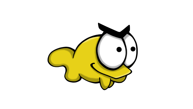
The placeholder.
I dropped the placeholder in a separate layer in Photoshop, to have not only as a reference, but also to be able to trace the lines of the character (on a new layer of course). I made sure to simplify the line art to make the process a bit faster.
I then cleaned up the lines a bit, just to see them clearer and still to be able to play around with the placement of the tail fin on each frame. I made the line art of the eyes and eyebrows, the mouth and the body on one layer and then copied it onto the other frames. I could choose this process because the only part that was going to move was Stephen’s tail fin. This was the best choice, given the fact that I knew that part of his body and face would always be covered by a weapon.
Once I was done with the fixed line art, I proceeded to sketch the fin starting with the frames that I decided to be the outer keyframes. These two keyframes would determine the range of the fin when it’s moving.
After the keyframes were there, I went on to sketch the fin on the frames in between the middle and the outer ones. I tried to make the movement look as fluid as possible, but at the same time kept the cartoony feeling that our game has.
When happy with the sketches, after I trying out the animation many times to make it look right, I made the final line art on each frame.
Color wise, I used the same local color (yellow) as the placeholder and colored the frames. Again, me and the other artist decided not to paint shadows in our animations. This decision was made so we could keep the cartoony theme of our game and as an added bonus make it easier for the player to see what is happening on the screen.
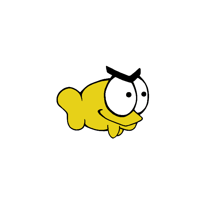
Finished animation.
On its own the finished animation looks a bit too simple, but in the game it looks good and I’m happy with the result.
Here’s a sprite sheet, showing each individual frame of the animation (not in order).

Hello there, Anna!
Great job on the animation! It looks very smooth and fluid. It’s fun to see how other groups that are making Selfish design their main character(our group is making Selfish too). He looks quite angry compared to ours(who looks almost psychotically happy) which is interesting. Smart thinking to not animate the fish “arms” and eyes since it will be covered anyway.
What program did you use to make the sprite sheet? Was it sprite packer? I understand how and why you’ve made the animation but why the uneven number of frames? That is the only part I didn’t understand since you said a maximum of 20, which is an even number(sorry for nitpicking xD). Also, you describe that the enemies animations looked similar. I would have loved to see a gif of that as well just so that I could compare.
You’ve done a nicely written post that is easy to understand.
Good job!
//Elin
LikeLiked by 1 person
Hey there !
That’s what I call a cool animation ! I really like the way you draw your fish by the way, it looks very different than ours haha (we’re making also making a game from the Selfish concept document) and I think I actually prefer your version of it. (Don’t tell anyone please 😛 )
I think you explained everything you have been through in a very detailed and precise way which is in my opinion very good for those that have no idea of what you are talking about ! I am also impressed by the number of frames you drew just to move one fin, I think it could have been done with less frames but the more the better I guess !
Also I think you shouldn’t say it looks simple, because I think it’s really good ! (From what I have seen thanks to the gif at least) And you got the impression of it being more than 2D because of the bouncing of the fin, so yeah, that’s far better than simple as you said :p
Anyway, that was overall a nice post, simple (the post, not the animation) and clear with lots of details about the creation, so well done !
Axel out !
/Axel
Team Quetzalcoatl
LikeLiked by 1 person